Talk:Creature Template: Difference between revisions
No edit summary |
No edit summary |
||
| Line 1: | Line 1: | ||
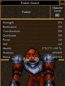
Here's the side by side with the old formatting in a way that avoids any stretching. It requires adjusting the px size of the image so it's about the same height as the table without the image then adding that to 300 and setting the sum as the table width, this keeps the table a constant 300 wide. | |||
{|width=550 border=1 | |||
!colspan=3| Tusker Guard | |||
|rowspan=14| [[Image:Tusker Guard.jpg|250px]] | |||
|- | |||
!Level: | |||
|colspan=2 align=center| 85 | |||
|- | |||
!width=100|Strength | |||
!width=100|Endurance | |||
!width=100|Coord | |||
|- | |||
|align=center| 350 | |||
|align=center| 250 | |||
|align=center| 300 | |||
|- | |||
!width=100|Quick | |||
!width=100|Focus | |||
!width=100|Self | |||
|- | |||
|align=center| 200 | |||
|align=center| 140 | |||
|align=center| 160 | |||
|- | |||
!width=100|<font color=red>Health</font> | |||
!width=100|<font color=Goldenrod>Stam</font> | |||
!width=100|<font color=blue>Mana</font> | |||
|- | |||
|width=100 align=center| 375 | |||
|width=100 align=center| 400 | |||
|width=100 align=center| 160 | |||
|- | |||
!width=100|Melee D | |||
!width=100|Missile D | |||
!width=100|Magic D | |||
|- | |||
|align=center|??? | |||
|align=center|??? | |||
|align=center|??? | |||
|- | |||
!<font color=green>XP:</font> | |||
|colspan=2 align=center|20,000xp | |||
|- | |||
!Weaknesses: | |||
|colspan=2 align=center|??? | |||
|- | |||
!Common Attacks: | |||
|colspan=2 align=center|??? | |||
|- | |||
!Notes: | |||
|colspan=2| | |||
|- | |||
|} | |||
---- | |||
You'd just do the same thing you suggested for larger images in the old format (scale them to 300px wide), here you're just scaling for vertical size instead. Although there aren't really that many really tall pics like that right now. --[[User:Tlosk|Tlosk]] 23:13, 3 March 2008 (CST) | You'd just do the same thing you suggested for larger images in the old format (scale them to 300px wide), here you're just scaling for vertical size instead. Although there aren't really that many really tall pics like that right now. --[[User:Tlosk|Tlosk]] 23:13, 3 March 2008 (CST) | ||
Revision as of 11:13, 4 March 2008
Here's the side by side with the old formatting in a way that avoids any stretching. It requires adjusting the px size of the image so it's about the same height as the table without the image then adding that to 300 and setting the sum as the table width, this keeps the table a constant 300 wide.
You'd just do the same thing you suggested for larger images in the old format (scale them to 300px wide), here you're just scaling for vertical size instead. Although there aren't really that many really tall pics like that right now. --Tlosk 23:13, 3 March 2008 (CST)
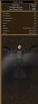
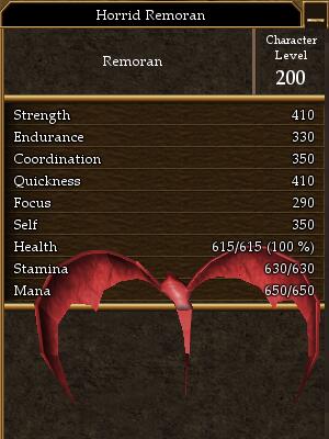
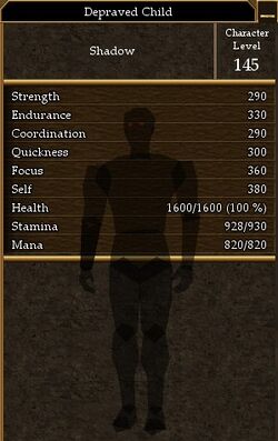
Here is the one issue I have with the side-by-side stat table/image. I'll use the extreme examples here:
--An Adventurer 22:38, 3 March 2008 (CST)
I was fiddling with the different settings trying to get something that wouldn't have to scroll two or three times to see it. I'm still trying some things but it seems that the critical variable is the image height. Some shots that people take when playing at a high resolution are really large (the shots I take are at a low resolution so the creature isn't stretched too far past the stats). If the image is smaller than the vertical height of the table then it just gets centered vertically.
As long as the image isn't larger than the scroll space the table wouldn't be stretched out too much. But I'm not really happy with how it looks right now, mainly just trying things out seeing what might look good and not have to scroll (and be able to accommodate a range of image sizes). I'll revert the stuff before I'm done and post what I come up with here. --Tlosk 22:29, 3 March 2008 (CST)
Tlosk, before you add to many more creatures, I think we should decide what style the template will be.
New:
Pros: No need to scroll to see stats+image
Cons: Different creatures will have different sized ID panels. ID panel panel and Creature information table will pretty much never be the same hieght naturally, which will stretch out table boxes.
Previous:
| Aerbax | ||
|---|---|---|
| File:Aerbax.jpg | ||
| Level: | 999 | |
| Strength | Endurance | Coord |
| 500 | 500 | 500 |
| Quick | Focus | Self |
| 500 | 500 | 500 |
| Health | Stam | Mana |
| 500250 | 5500 | 10500 |
| Melee D | Missile D | Magic D |
| ??? | ??? | ??? |
| XP: | ??? | |
| Weaknesses: | AR Fire (was used on LC, other elements were untested) | |
| Common Attacks: | Hollow Lightning Melee damage, many special/boss only offensive spells. | |
| Notes: | Aerbax is Creature Type: Aerbax. Aerbax was only available to be killed once. After that he was replaced by Aerbax's Shadow | |
Pros: All tables will be the same width, monster ID panels are always 300px, and any live shot can be cropped/resized to 300px.
Cons: Have to scroll to see some stats if creature picture is too large.
Hopefully, we can eventually replace all Monster ID panels with live shots (which will be shorter). But if scrolling is an issue, I propose simply moving the placement of the image:
Option 1:
| Aerbax | ||
|---|---|---|
| Level: | 999 | |
| Strength | Endurance | Coord |
| 500 | 500 | 500 |
| Quick | Focus | Self |
| 500 | 500 | 500 |
| Health | Stam | Mana |
| 500250 | 5500 | 10500 |
| File:Aerbax.jpg | ||
| Melee D | Missile D | Magic D |
| ??? | ??? | ??? |
| XP: | ??? | |
| Weaknesses: | AR Fire (was used on LC, other elements were untested) | |
| Common Attacks: | Hollow Lightning Melee damage, many special/boss only offensive spells. | |
| Notes: | Aerbax is Creature Type: Aerbax. Aerbax was only available to be killed once. After that he was replaced by Aerbax's Shadow | |
Option 2:
| Aerbax | ||
|---|---|---|
| Level: | 999 | |
| Strength | Endurance | Coord |
| 500 | 500 | 500 |
| Quick | Focus | Self |
| 500 | 500 | 500 |
| Health | Stam | Mana |
| 500250 | 5500 | 10500 |
| Melee D | Missile D | Magic D |
| ??? | ??? | ??? |
| XP: | ??? | |
| File:Aerbax.jpg | ||
| Weaknesses: | AR Fire (was used on LC, other elements were untested) | |
| Common Attacks: | Hollow Lightning Melee damage, many special/boss only offensive spells. | |
| Notes: | Aerbax is Creature Type: Aerbax. Aerbax was only available to be killed once. After that he was replaced by Aerbax's Shadow | |
Option 3:
| Aerbax | ||
|---|---|---|
| Level: | 999 | |
| Strength | Endurance | Coord |
| 500 | 500 | 500 |
| Quick | Focus | Self |
| 500 | 500 | 500 |
| Health | Stam | Mana |
| 500250 | 5500 | 10500 |
| Melee D | Missile D | Magic D |
| ??? | ??? | ??? |
| XP: | ??? | |
| Weaknesses: | AR Fire (was used on LC, other elements were untested) | |
| Common Attacks: | Hollow Lightning Melee damage, many special/boss only offensive spells. | |
| Notes: | Aerbax is Creature Type: Aerbax. Aerbax was only available to be killed once. After that he was replaced by Aerbax's Shadow | |
| File:Aerbax.jpg | ||
What do you think? Go with new, previous, option 1, option 2, or option 3?
Personally, I like the previous the best. I don't really mind the little bit of scrolling. Plus - if we are using the ID stat panel as the Image for most creatures, they wont need to scroll down because the stats are already there.
--An Adventurer 22:13, 3 March 2008 (CST)
Thanks for the info. Looks like it might not be worth doing for every single monster, but would be good to have it for stuff people fight a lot. --Tlosk 17:05, 28 February 2008 (CST)
I don't know the formula, but you find out a creatures defenses are by how much experience you gain directly into your attack skill. It might be something as simple as (creature def) - (your attack) = xp gained into skill, but I bet its a little more than that. Also, I'm not sure when you gain that exp.
anyway there was at some point a decal plug-in that would calculate defenses, Topheron's something, which is why assess creature 7 is Topheron's Blessing. I don't use decal so I don't know if the plug-in is still around or if there is something new that does the same thing.
Ah, found something on maggies. this might have some info: http://www.thejackcat.com/AC/Pets/statdirections.htm
--An Adventurer 15:32, 28 February 2008 (CST)
--Tlosk 14:01, 28 February 2008 (CST)
What's the secret for figuring out the melee missle and magic defense values?
I think it's probably better to be redundant and have a consistent format than have the values missing if someone uses a live action shot instead of the stats panel. Also it's nice to have something that is copy/pastable, which the images aren't.
--An Adventurer 17:07, 5 December 2007 (CST)
Yeah I agree that stats aren't actually important. But I think we should keep them there just to have the info available. Plus, you can some times determine a creatures skills based on stats. The 50/50 focus/self creature probably won't cast magic, etc. The monster pages list all stats already (example: humans) but people may not always get to a creature's individual page from the monster page, so I think we should leave them on.
--Sanguis 16:32, 5 December 2007 (CST)
I added a minor tweak to the xp color, I think it looks cool and is still kind of eye catching, I considered making it lime but that seems too bright.
--Sanguis 16:30, 5 December 2007 (CST)
Looks good for sure, the colors for hp/stam/mana are a great idea, the only problem I have with it is the stats being repeated, I think take out the str / end / coord etc and just leave the rest there. The monsters actual stats are not that important overall, mostly just hp / stam etc and the rest are crucial, how often do we really look at the individual stats of a monster? The only reason I could see keeping them in is for the sake of being thorough, but functionally I think they're kinda useless and clutter up the template a bit much.
--An Adventurer 23:21, 3 December 2007 (CST) I've made the changes to the template. let me know what you think.
--An Adventurer 23:01, 3 December 2007 (CST) The great thing about the wiki is we don't have to include locations to find creatures or what trophies they drop, as you can just click on the what links here button to see all that. Of course, this also means we need to get to work on a template for individual dungeon pages, and make sure they include a list of monsters with links to their pages. But in the end, it will be a much better system than current fan sites.
--Sanguis 22:38, 3 December 2007 (CST)
Realized that after the fact that we may end up not knowing stats, though I think stats shots are usually the best to show the mob.
--An Adventurer 22:33, 3 December 2007 (CST)
We may want to keep the stats in there, unless we always use the ID panel as the image. But sometimes the ID panel is not the greatest image of the creature itself since it doesn't show size, and we can't always ID creatures but may obtain the stats from other sources. Plus I've made lots of links to invididual creature pages while writing quests up, and if these links don't show general stats they aren't as helpful. We may want to leave secondary attributes on at least.


