--Tlosk 12:09, 28 March 2008 (CDT)Yeah that's easy to do, I had to do that with some pictures on the old zone pages, it made it very easy to manipulate the position of the image and text using borderless tables and matching the background color with the cells. Also I need to double check this but I'm pretty sure if a WidthxHeightpx is used it will make it so any size picture can be used (an ideal size would mean no resizing or bags on the sides but it would mean there'd be no fiddling with numbers each time).
Also I'm not sure which is better, should the Introduced in Patch line stay at the top or go in a bullet under Notes?
One idea for the new table. If its possible, put in a grey background color for the table cell the image is in, so images that are too short are not floating in white. --An Adventurer 11:36, 28 March 2008 (CDT)
--Tlosk 23:23, 26 March 2008 (CDT) Ok cool, I'm going to let it sit for a day or two to see if anything else occurs to us, then I can make a conversion macro (probably 95% of the entries are the same format now so it shouldn't be that hard to make one).
that looks really good. just need to redo the 600+ monster pages already done :P --An Adventurer 23:03, 26 March 2008 (CDT)
--Sanguis 22:53, 26 March 2008 (CDT) That last template was perfect in my opinion, the double line works out well and you're right with the creature type and lvl being self explanatory
--Tlosk 22:06, 26 March 2008 (CDT) Looks like specifying the hex color works (bgcolor=#e0e0e0 instead of bgcolor=lightgray), although may be worth doing so for all the colors (even though it appears that just the light gray was different between IE and FF.
--Tlosk 21:55, 26 March 2008 (CDT)Out of curiosity I checked how it looked in IE7 (I use Firefox) and it's thwacked lol. I imagine there's a way to have it be consisent but I'll have to look into it. (So if you're using IE, click the thumbnail below to see what I was trying for lol. Only Microsoft would be able to interpret light gray as meaning dark blue.
--Tlosk 20:50, 26 March 2008 (CDT) A few more tweaks - creature type and lvl are self explanatory, perhaps mirroring the stat panel would be nice. In most templates there's redundant formatting that can be removed to make the template cleaner and easier to populate with values (for example the width of a column only needs to be set for the first cell in that column, and quote marks aren't needed). Perhaps using a bulleted list for the notes would keep it clean and look good no matter how many notes there are or the size of each individual note (tables can be difficult to make look good when lots of variability). Perhaps using the label "Trophies & Items" would force a double height row so there'd be room for 2 or 3 items without changing the size of the table (again for the purpose of allowing a standard size for live images). Here's a suggestion for a template (just a suggestion, if a new template is decided on, it should go through a couple iterations to make sure it's what everyone wants before old entries get updated):
| Biaka | 
| ||
|---|---|---|---|
| Margul | LVL 161 | ||
| Strength | Endurance | Coord | |
| 420 | 500 | 450 | |
| Quick | Focus | Self | |
| 420 | 400 | 400 | |
| Health | Stamina | Mana | |
| 7500 | 7500 | 7500 | |
| Melee D | Missile D | Magic D | |
| 500 | 400 | 450 | |
| XP: | 1,500,000xp | ||
| Weaknesses: | Lightning, Cold | ||
| Common Attacks: | Slash, Fire | ||
| Trophies & Items: | Large Margul Hide | ||
Notes
- Found primarily on North Singularity Caul
- Able to debuff player's weapon with Lure Blade IV
- Uses level VII life vulns and war spells
- Large agro range
- A variant of the Biaka, the Fallen Margul, drops the Spear of the Fallen
--Sanguis 19:28, 26 March 2008 (CDT)
Good points, I think notes should maybe be a seperate entry or its own little table as well, keep things like notes on what spells a mob casts or high regen rates etc.
I still think the look of that template (props to you as well) is much better and easier on the eyes. Also, if you could make those tools available that would be fantastic
--Tlosk 18:36, 26 March 2008 (CDT)
Lot of good points, I have a few comments, not necessarily for or against just clarification points (I'll post again later after thinking more about some of these). The trophies have their own column in the stats tables on the class pages (for example Phyntos Wasp). I'd like to see the trophies added to the panels as well though. The notes section is kind of a bugaboo, for a lot of stuff there's no notes (and leaving it blank means it doesn't render a border in IE, but the ??? for notes looks weird too when there isn't anything to put there. I'm thinking it might be worthwhile to move the Notes section out of the table panel and have it below the box. The main reason (besides being blank for a lot of creatures) is that for some stuff it's short, for some stuff it can be really long, and this screws around with how the image is sized if it's to the side. Having it below the panel would make the size of the notes have no negative impact on sizing issues, as well as not look bad if it's empty. Also it would let you be verbose if needed, instead of keeping things terse since it's a small space in the table.
If we could get a fixed size table (no elements that would vary enough to drastically alter the size of the table) it would be really really great. As the tables are now, setting the table width to 600 and using an image that's 300 x 420 works great.
As far as stats panel images go, I've been working on the creatures for the last week and my first priority was to get entries and stats for everything. Taking a live shot is a lot more time intensive so I'm saving a big push on that until the Creatures section is fully populated. Also live shots can be taken by anyone, I made a special guy with spec'd creature assess to get stats and that splits up the work some. And while I agree the stats are redundant, often the picture is excellent, so as a default image I think it's fine, with live shots preferred of course. All of the stats table pages are done now and I'd say we've got about 60-70% of creatures so we're getting close.
Oh and the template you like was me playing around with table settings seeing what was possible, I hadn't necessarily meant it as a new template, I was just trying out format experiments. Adventurer noticed it and that initiated the discussion below. One of the downsides is that lots of formatting makes it a lot more complicated to quickly fill out the info (mainly because you have to insert values into the middle of stuff instead of just arrow-keying down to the next line).
Last comment is on a side note, I've made some tools to save time and if there's some interest I can polish them and make them available. One is a template tool, that basically has all your templates available (local text files so you can change them as desired), so with a single click you have any desired template placed into the clipboard ready to be pasted. It also has a couple of code formating buttons (you copy the name or text, click the button and it adds the formatting code around it, ready to be pasted). And lastly it has a couple buttons you can load with any text at any time so if you're using a couple pieces of text over and over you can keep them all at the ready for pasting.
The other tool is an image handling tool, you hit ALT+PRT SCR in game, and it will extract the icon from an id panel and save it as a file, extract the id panel and save it also. And it can give a frame of selectable size to crop out stuff when doing a live shot (makes it a lot easier to have a centered image of a fixed size that will be good for the panel sizing).
--Sanguis 12:05, 26 March 2008 (CDT)
I think we really should add a trophies section to the template, it should be above notes (I consider notes as misc notes that may be important to the mob), trophies should have their own distinction and they are very very important so i'm not sure why we've left them out at this point, the following is an example of what i'm talking about. Also, I REALLY think we should use this template, it looks so much better than the others in my opinion, it's much more readable and it just looks good, props to adventurer for the design.
Also, we really need to settle on what kind of picture we're going to use, using the stat panel picture in the side seems redundant because it shows the same info we have in the table, the problem is that it's considerably easier to get a good panel shot than it is to get a good "live" shot. I personally think the live shots look much better and are less redundant, if we use live shots we can just scale them or set a default size / resize images as necessary.
My vote is to use this template and only use "live" screenshots when possible, and if not then replace all ID panel screenshots with "live" shots asap.
| Depraved Child | 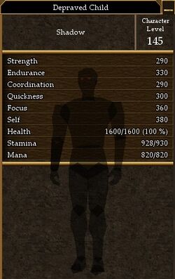
| ||
|---|---|---|---|
| Creature Type | Shadow | ||
| Level: | 145 | ||
| Strength | Endurance | Coord | |
| 290 | 330 | 290 | |
| Quick | Focus | Self | |
| 300 | 360 | 380 | |
| Health | Stam | Mana | |
| 1600 | 930 | 820 | |
| Melee D | Missile D | Magic D | |
| ??? | ??? | ??? | |
| XP: | 12,000xp | ||
| Weaknesses: | Fire, Slash | ||
| Common Attacks: | ??? | ||
| Trophies: | |||
| Notes: | |||
--Tlosk 12:00, 6 March 2008 (CST)
Sweet, thanks for making the templates.
--Tlosk 12:09, 4 March 2008 (CST)
That's a good idea, and it could let us link to the class description page as well. And it wouldn't necessarily have to be side by side, if the picture is short it would work going on top like before, I guess I'm falling on the side of there isn't an optimal format when the pictures aren't standardized so maybe two layouts would be optimal instead. One for when images are tall and narrow, and one for when the images are short and wide.
ah I didn't realize you could do that. I guess that'd work then. The only problem I see is that you have to adjust the picture's height by changing the width, which will be a bit tedious. And there is still the issue that if the picture is really short its just floating in space, but maybe that just bugs me.
what do you think about adding the creature type to the individual panel? It wouldn't really be needed on most creatures, but I can think of some where it would be helpful (imps summoned by mudmouth are tiny tusker shadows, shadow type, DI ruschk are undead, paradox-olthoi are not olthoi, etc)
| Tusker Guard | 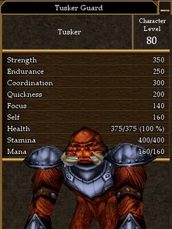
| ||
|---|---|---|---|
| Creature Type | Tusker | ||
| Level: | 85 | ||
| Strength | Endurance | Coord | |
| 350 | 250 | 300 | |
| Quick | Focus | Self | |
| 200 | 140 | 160 | |
| Health | Stam | Mana | |
| 375 | 400 | 160 | |
| Melee D | Missile D | Magic D | |
| ??? | ??? | ??? | |
| XP: | 20,000xp | ||
| Weaknesses: | ??? | ||
| Common Attacks: | ??? | ||
| Notes: | |||
--An Adventurer 09:15, 4 March 2008 (CST)
Here's the side by side with the old formatting in a way that avoids any stretching. It requires adjusting the px size of the image so it's about the same height as the table without the image then adding that to 300 and setting the sum as the table width, this keeps the table a constant 300 wide.
You'd just do the same thing you suggested for larger images in the old format (scale them to 300px wide), here you're just scaling for vertical size instead. Although there aren't really that many really tall pics like that right now. --Tlosk 23:13, 3 March 2008 (CST)
Here is the one issue I have with the side-by-side stat table/image. I'll use the extreme examples here:
--An Adventurer 22:38, 3 March 2008 (CST)
I was fiddling with the different settings trying to get something that wouldn't have to scroll two or three times to see it. I'm still trying some things but it seems that the critical variable is the image height. Some shots that people take when playing at a high resolution are really large (the shots I take are at a low resolution so the creature isn't stretched too far past the stats). If the image is smaller than the vertical height of the table then it just gets centered vertically.
As long as the image isn't larger than the scroll space the table wouldn't be stretched out too much. But I'm not really happy with how it looks right now, mainly just trying things out seeing what might look good and not have to scroll (and be able to accommodate a range of image sizes). I'll revert the stuff before I'm done and post what I come up with here. --Tlosk 22:29, 3 March 2008 (CST)
Tlosk, before you add to many more creatures, I think we should decide what style the template will be.
New:
Pros: No need to scroll to see stats+image
Cons: Different creatures will have different sized ID panels. ID panel panel and Creature information table will pretty much never be the same hieght naturally, which will stretch out table boxes.
Previous:
| Aerbax | ||
|---|---|---|
| File:Aerbax.jpg | ||
| Level: | 999 | |
| Strength | Endurance | Coord |
| 500 | 500 | 500 |
| Quick | Focus | Self |
| 500 | 500 | 500 |
| Health | Stam | Mana |
| 500250 | 5500 | 10500 |
| Melee D | Missile D | Magic D |
| ??? | ??? | ??? |
| XP: | ??? | |
| Weaknesses: | AR Fire (was used on LC, other elements were untested) | |
| Common Attacks: | Hollow Lightning Melee damage, many special/boss only offensive spells. | |
| Notes: | Aerbax is Creature Type: Aerbax. Aerbax was only available to be killed once. After that he was replaced by Aerbax's Shadow | |
Pros: All tables will be the same width, monster ID panels are always 300px, and any live shot can be cropped/resized to 300px.
Cons: Have to scroll to see some stats if creature picture is too large.
Hopefully, we can eventually replace all Monster ID panels with live shots (which will be shorter). But if scrolling is an issue, I propose simply moving the placement of the image:
Option 1:
| Aerbax | ||
|---|---|---|
| Level: | 999 | |
| Strength | Endurance | Coord |
| 500 | 500 | 500 |
| Quick | Focus | Self |
| 500 | 500 | 500 |
| Health | Stam | Mana |
| 500250 | 5500 | 10500 |
| File:Aerbax.jpg | ||
| Melee D | Missile D | Magic D |
| ??? | ??? | ??? |
| XP: | ??? | |
| Weaknesses: | AR Fire (was used on LC, other elements were untested) | |
| Common Attacks: | Hollow Lightning Melee damage, many special/boss only offensive spells. | |
| Notes: | Aerbax is Creature Type: Aerbax. Aerbax was only available to be killed once. After that he was replaced by Aerbax's Shadow | |
Option 2:
| Aerbax | ||
|---|---|---|
| Level: | 999 | |
| Strength | Endurance | Coord |
| 500 | 500 | 500 |
| Quick | Focus | Self |
| 500 | 500 | 500 |
| Health | Stam | Mana |
| 500250 | 5500 | 10500 |
| Melee D | Missile D | Magic D |
| ??? | ??? | ??? |
| XP: | ??? | |
| File:Aerbax.jpg | ||
| Weaknesses: | AR Fire (was used on LC, other elements were untested) | |
| Common Attacks: | Hollow Lightning Melee damage, many special/boss only offensive spells. | |
| Notes: | Aerbax is Creature Type: Aerbax. Aerbax was only available to be killed once. After that he was replaced by Aerbax's Shadow | |
Option 3:
| Aerbax | ||
|---|---|---|
| Level: | 999 | |
| Strength | Endurance | Coord |
| 500 | 500 | 500 |
| Quick | Focus | Self |
| 500 | 500 | 500 |
| Health | Stam | Mana |
| 500250 | 5500 | 10500 |
| Melee D | Missile D | Magic D |
| ??? | ??? | ??? |
| XP: | ??? | |
| Weaknesses: | AR Fire (was used on LC, other elements were untested) | |
| Common Attacks: | Hollow Lightning Melee damage, many special/boss only offensive spells. | |
| Notes: | Aerbax is Creature Type: Aerbax. Aerbax was only available to be killed once. After that he was replaced by Aerbax's Shadow | |
| File:Aerbax.jpg | ||
What do you think? Go with new, previous, option 1, option 2, or option 3?
Personally, I like the previous the best. I don't really mind the little bit of scrolling. Plus - if we are using the ID stat panel as the Image for most creatures, they wont need to scroll down because the stats are already there.
--An Adventurer 22:13, 3 March 2008 (CST)
Thanks for the info. Looks like it might not be worth doing for every single monster, but would be good to have it for stuff people fight a lot. --Tlosk 17:05, 28 February 2008 (CST)
I don't know the formula, but you find out a creatures defenses are by how much experience you gain directly into your attack skill. It might be something as simple as (creature def) - (your attack) = xp gained into skill, but I bet its a little more than that. Also, I'm not sure when you gain that exp.
anyway there was at some point a decal plug-in that would calculate defenses, Topheron's something, which is why assess creature 7 is Topheron's Blessing. I don't use decal so I don't know if the plug-in is still around or if there is something new that does the same thing.
Ah, found something on maggies. this might have some info: http://www.thejackcat.com/AC/Pets/statdirections.htm
--An Adventurer 15:32, 28 February 2008 (CST)
--Tlosk 14:01, 28 February 2008 (CST)
What's the secret for figuring out the melee missle and magic defense values?
I think it's probably better to be redundant and have a consistent format than have the values missing if someone uses a live action shot instead of the stats panel. Also it's nice to have something that is copy/pastable, which the images aren't.
--An Adventurer 17:07, 5 December 2007 (CST)
Yeah I agree that stats aren't actually important. But I think we should keep them there just to have the info available. Plus, you can some times determine a creatures skills based on stats. The 50/50 focus/self creature probably won't cast magic, etc. The monster pages list all stats already (example: humans) but people may not always get to a creature's individual page from the monster page, so I think we should leave them on.
--Sanguis 16:32, 5 December 2007 (CST)
I added a minor tweak to the xp color, I think it looks cool and is still kind of eye catching, I considered making it lime but that seems too bright.
--Sanguis 16:30, 5 December 2007 (CST)
Looks good for sure, the colors for hp/stam/mana are a great idea, the only problem I have with it is the stats being repeated, I think take out the str / end / coord etc and just leave the rest there. The monsters actual stats are not that important overall, mostly just hp / stam etc and the rest are crucial, how often do we really look at the individual stats of a monster? The only reason I could see keeping them in is for the sake of being thorough, but functionally I think they're kinda useless and clutter up the template a bit much.
--An Adventurer 23:21, 3 December 2007 (CST) I've made the changes to the template. let me know what you think.
--An Adventurer 23:01, 3 December 2007 (CST) The great thing about the wiki is we don't have to include locations to find creatures or what trophies they drop, as you can just click on the what links here button to see all that. Of course, this also means we need to get to work on a template for individual dungeon pages, and make sure they include a list of monsters with links to their pages. But in the end, it will be a much better system than current fan sites.
--Sanguis 22:38, 3 December 2007 (CST)
Realized that after the fact that we may end up not knowing stats, though I think stats shots are usually the best to show the mob.
--An Adventurer 22:33, 3 December 2007 (CST)
We may want to keep the stats in there, unless we always use the ID panel as the image. But sometimes the ID panel is not the greatest image of the creature itself since it doesn't show size, and we can't always ID creatures but may obtain the stats from other sources. Plus I've made lots of links to invididual creature pages while writing quests up, and if these links don't show general stats they aren't as helpful. We may want to leave secondary attributes on at least.
