--Tlosk 18:29, 27 April 2008 (CDT)That's an excellent idea about the special properties. I researched background images a while back and as far as I was able to determine there's only one possible background image and it's set for the entire page at the website level. I could be wrong though. Also I finally finished a first version of the new mapping program and finished one map, I'm going to make a post in a minute on the talk page for the Dungeon template. I'll post what I figure out with the div code here in the morning (so far not working well).
well, if the dark background has too many issues, the grey was fine. One thought. Instead of linking all of the special properties to their page, we can just make the "Special Properties:" text link to the spec. prop. category page. This way, the font color change would already be part of the template. Its not like there are many players that are completely unfamiliar with what special properties do, so its not completely necessary to link each special prop to its page.
Another option (maybe) instead of using a dark brown color is to take a screenshot of an ID panel with a lage blank section (Pyreal?), and cut it down to just the repeating pattern texture. And then use that image as the background. However, I'm not sure if that is possible with table code. Might have to use div like you said and create our own table using that. --An Adventurer 13:34, 27 April 2008 (CDT)
--Tlosk 12:23, 27 April 2008 (CDT)The longer I look at it's growing on me, I'm going to do some more research to see if we can get control of the table borders (or perhaps mimic a table layout using div tags).
--Tlosk 12:06, 27 April 2008 (CDT) I tried a few but since it's a texture it didn't look too good with any solid browns I tried. The borders on tables don't have fine grain control as far as I've found looking through the documentation. Also anything that's linked would have to have a special font color added to a piped link to make it readable (since the links default to the dark blue even if the rest of the text is colored). The three links below show three possiblities, including standard.
Here's the best example I came up with earlier, I averaged the texture into a single color for the best approximation.
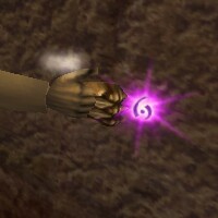
| Royal Runed Knuckles | |
| _________________________________________ | |
| Value: 15,000 200 Burden Units |
File:Royal Runed Knuckles icon.png |
| _________________________________________ | |
| A set of fighting knuckles crafted by Silveran smiths, once commissioned by Varicci on Ispar for the Royal Armory.
| |
Yeah, I was thinking of ways to reduce some of the clutter on the item tables. This would probably work great. One suggestion though would be to take it one step further - Make the table look more like ID panel. Dark brownish-grey background with white text. And we should obviously do this with all the item templates, not just weapons. --An Adventurer 11:22, 27 April 2008 (CDT)
--Tlosk 08:20, 27 April 2008 (CDT) It seems to me like it's hard to make nice looking tables when there's a lot of disparate info. Would making a template more similar to the in game ID panel be better? Something like this? I think armor might be a good candidate for this as well. This would let it be text searchable/copiable while still being compact and familar enough to be easily parsed when reading. Also I don't know when it will be done but I'm working on making a decal plugin that would be able to pull the majority of the info and add the template formatting so it would be a lot faster for us to add old content.
From the Royal Runed Weapons Quest introduced in the The Price of Loyalty event.

| Royal Runed Knuckles | |
| Value: 15,000 200 Burden Units |
File:Royal Runed Knuckles icon.png |
| A set of fighting knuckles crafted by Silveran smiths, once commissioned by Varicci on Ispar for the Royal Armory.
| |
Notes
- Randomly found in Sturdy Steel Chests.
- The Gossamer Flesh spell casts on 10% of strikes.
- See Royal Runed Weapons for a list of the other variants, and Princely Runed Weapons for the 100+ versions.